Look Over Here: Attention-Directing Composition of Manga Elements
ACM Transactions on Graphics 33(4) (Proc. SIGGRAPH 2014)Ying Cao Rynson W.H. Lau Antoni B. Chan

Abstract
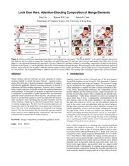
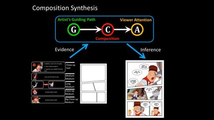
Picture subjects and text balloons are basic elements in comics, working together to propel the story forward. Japanese comics artists often leverage a carefully designed composition of subjects and balloons (generally referred to as panel elements) to provide a continuous and fluid reading experience. However, such a composition is hard to produce for people without the required experience and knowledge. In this paper, we propose an approach for novices to synthesize a composition of panel elements that can effectively guide the reader's attention to convey the story. Our primary contribution is a probabilistic graphical model that describes the relationships among the artist's guiding path, the panel elements, and the viewer attention, which can be effectively learned from a small set of existing manga pages. We show that the proposed approach can measurably improve the readability, visual appeal, and communication of the story of the resulting pages, as compared to an existing method. We also demonstrate that the proposed approach enables novice users to create higher-quality compositions with less time, compared with commercially available programs.Video
Downloads

|

|

|

|
| Paper | Supplementary Material | Video | Presentation Slides |
BibTex
@article{Cao2014,

 author = {Y. Cao and R. Lau and A. B. Chan},

 title = {Look Over Here: Attention-Directing Composition of Manga Elements},

 journal = {ACM Transactions on Graphics (Proc. of SIGGRAPH 2014)},

 volume = {33},

 issue = {4},

 year = {2014}

}